Ferrari has thrown down the gauntlet with its 2026 F1 livery, unleashing a bold new look that’s set tongues wagging across the F1 universe.
Key Takeaways:
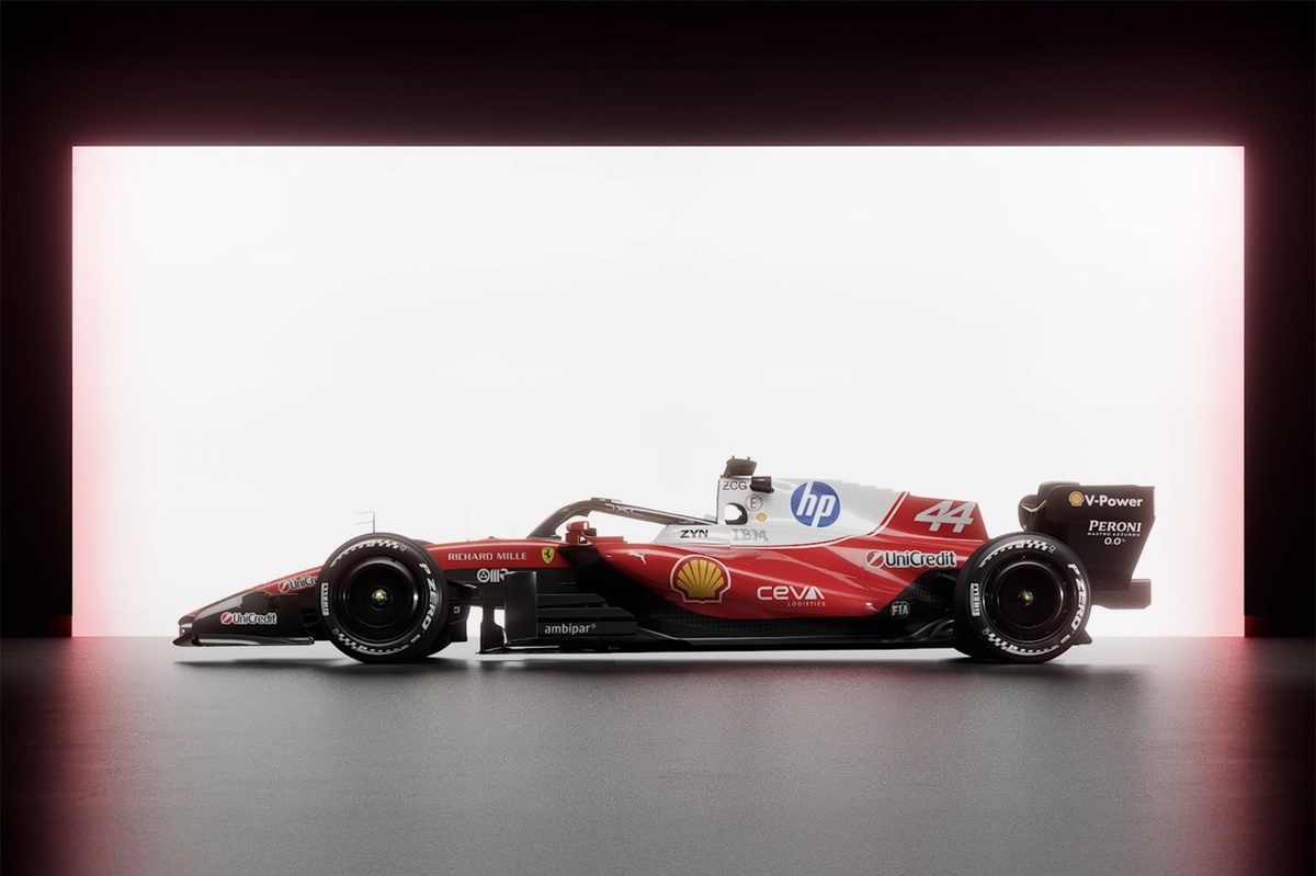
- Ferrari revealed its SF-26 livery on January 23rd, showcasing a red, white, and black design.
- Fan reception is largely positive, praising the improved integration of white and the HP logo.
- The design evokes a modern interpretation of the classic Niki Lauda era.
- A small but vocal minority critique the increased white as diluting Ferrari's traditional red identity.
A Striking New Era for the Prancing Horse
Unveiled on January 23rd, the Scuderia Ferrari SF-26 livery signals a significant aesthetic shift. This vibrant red and white design, accented with black details, hit the track ahead of the team's shakedown. The immediate fan response? A whirlwind of opinions.
For many, this isn't just a new paint job; it's a statement. The increased prominence of white is a noticeable departure, with many supporters celebrating its seamless integration.
The HP Logo: From Eyesore to Elegance?
One of the most talked-about elements is the transformation of the HP logo placement. Previously a point of contention, fans are now applauding how the new design embraces the sponsor. It's a huge win for Ferrari's commercial aesthetic.
Social media exploded with comments like, "The white is actually much better integrated now, looks insane," and "The HP logos don't look like an eyesore." This suggests a conscious effort by Maranello to refine its branding.
Echoes of a Golden Age: Lauda-Era Homage?
The revamped livery isn't just modern; it’s steeped in history. Several fans drew parallels to the iconic liveries of the Niki Lauda era, known for their clean and simple yet powerful designs. This blend of heritage and contemporary flair is a masterstroke.
One fan enthusiastically declared it "a modern twist on the Niki Lauda era... Simple and clean, doesn't try to do too much." The choice of a brighter red, similar to the SF23 and SF25, further enhances this classic-meets-modern appeal.
The Divide: Too Much White for the Rossa?
While enthusiasm is high, not everyone is convinced. A segment of the fanbase argues that the sheer volume of white detracts from Ferrari's quintessential identity. For these purists, a Ferrari should be unmistakably "the red car."
Critics voiced their dissent, with one commenting, "Too much white. It's not a red car. I don’t like it either." This highlights the challenge of balancing tradition with modern design trends in a sport as passionate as Formula 1.
Beyond Aesthetics: Will the SF-26 Bring Pace?
Ultimately, while the aesthetics spark debate, the true test of the SF-26 lies on the track. As one fan aptly put it, the design "looks beautiful, even better if it doesn't turn out to be a wheelie bin."
The livery might be stunning, but success for Ferrari in 2026 will be measured by championship points, not paint schemes. All eyes now turn to the performance of this striking new machine.